W-EYE TEN
10 designers
10 years of W-eye
When design becomes storytelling
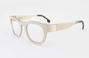
Ten years of being in business marks an important moment in a brand’s history. But it’s even more than that for a brand like W-Eye, which invented a new product category: hingeless eyewear made of wood and aluminum.
It’s not a given that the market will understand the value of a radically new product, especially when it is offered not by a well-known multinational company but rather by a small, family business. However, thanks to the combination of innovation + design, it happened.
W-Eye Ten – Italian design collection is therefore a celebration of a successful entrepreneurial gamble: one made by Doriano Mattellone and his sons (for decades subcontractors in the furniture sector for top international design brands) and Matteo Ragni, the Art Director of W-Eye since its inception.
However, W-Eye Ten – Italian design collection is also a cultural and experimental gesture, emblematic of a design method in which innovation is born out of a mix of expertise, intuition and connections between people from different worlds. Innovation driven by the “human factor”.
That expressed in the art direction of Matteo Ragni, who believes in collective rather than solo efforts.
That of the designers, who decided to get involved solely for the pleasure of working with a brand that knows how to take a risk.
And, of course, that of Mattellone and his sons, who champion Italian artisanship without nostalgia, looking towards the future with creativity.
There’s also a “human factor” in the eyewear that the designers created, using the molded “mask” as a starting point from which to say something about themselves and to tell stories.
It transforms design from an individual act into a collective one. In interpreting a product as a personal story, but one able to become universal, we find in W-Eye Ten – Italian design collection the creative strength of contemporary Italian design. A project that leverages collaboration, sharing and presenting stories.
This isn’t the storytelling of the marketing world but rather authentic stories, lenses through which we can see not only the product’s creators, but also ourselves, the people who use them. The perfect way to reawaken our respect for objects in an age of intangibility.
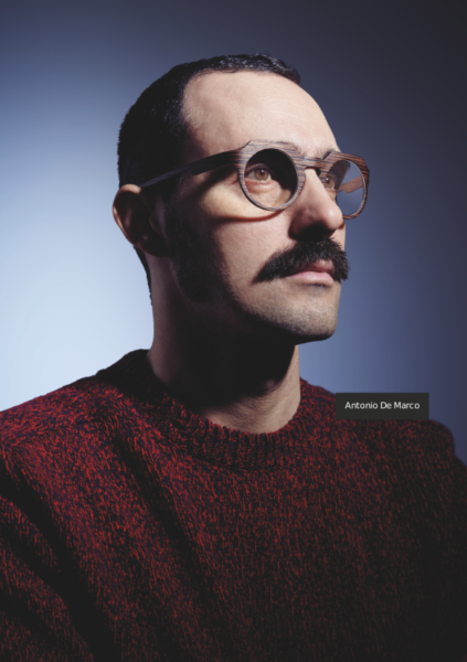
Antonio De Marco
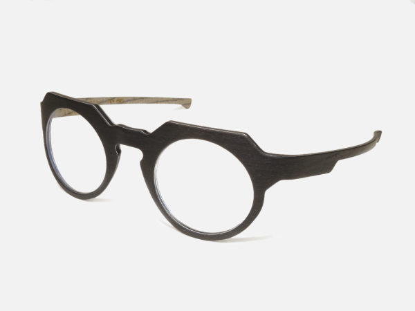
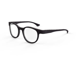
When I look at these glasses I feel more represented by the process behind their creation than by the final aesthetic of the product. In developing the design, I wanted to merge two different aesthetics into a single object: a curved geometry and a rigorous geometry. The upper part of the frame is made up of straight segments while the lower part is a gentle, continuous curve. I wanted to try and find a dialogue between two ways of drawing lines on paper and apply them to an object made for the human face.
The glasses, in all of the different versions and materials I chose, always have a dark, uniform surface on the outermost layer. This is to highlight the geometry and the contrast with the face, as well as to dialogue with the two layers of thin aluminum. The innermost surface was produced in a variety of woods, light and with a bit of color, let’s call it brio.
Odoardo Fioravanti
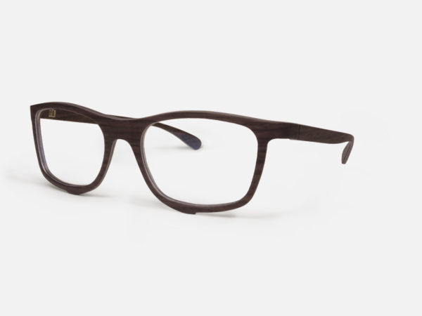
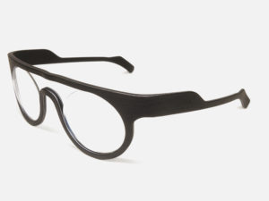
The design of Drop eyewear corresponds to a consideration about how to manage the attention that people focus on glasses frames. A shape that has a bit of the “architect” about it, allows a touch of “punk” just below both lenses. Two small, symmetrical marks add a cyberpunk accent to an otherwise regular shape and become like two stands when the glasses are placed open on a table top, transforming them into an odd type of decorative household accessory.
Diego Grandi
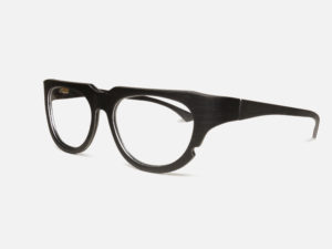
The W-Eye project gravitates around the concept of imperfection.
Like a mole which characterizes and defines a body or a face, a little interruption, a notch in the frame, made possible by the solid aluminum core, gives the glasses a modest sign of distinction and at the same time character.
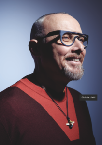
Giulio Iacchetti
For this project, considering that the invention of hingeless, wraparound frames in bent wood is so original, I decided to highlight the importance and centrality of the frame. So, the idea was to create a structure that would “host” the lenses: not surrounding them along the entire perimeter but rather limited to having enough contact with the edge to support and hold them in place. The result is a frame with lots of personality, an accessory that, to me, seems bold. To develop the project a step further, I imagine a colored film insert that overlaps the lenses to increase the eccentricity of the design.
JoeVelluto
The MATCH glasses are primarily the result of 2 reflections. First, all W-Eye frames are created from the union (therefor a “match”) between 2 materials, wood and aluminum. Second, I thought about the use of wood as a natural material and therefore easily subject to the effects of the 4 elements. As a result, the idea of relating wood and fire came spontaneously, generating a match (in this case the word is understood in its other sense, as what you use to light a fire). This is a detail that is especially noticeable when you remove your glasses rather than when you’re wearing them.
.
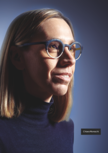
Chiara Moreschi
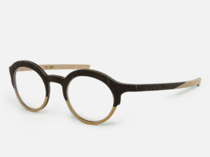
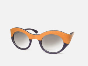
The shape of the glasses is classic, simple. However, the use of two different veneers gives the frame an unexpected aspect, creating a distinct line: above and below, full and empty. Thinking about the unique characteristic of W-Eye, the use of thin layers of wood, I decided to put two different woods side by side to achieve a two-tone effect that enhances a detachment in the form, as if to recreate the effect of a frame that surrounds only the upper part of the lenses. I was also interested in the fact that, for specific structural reasons, W-Eye frames start out with an essentially “flat” blank, so that the two-tone effect is noticeable on the front but also results in a color change on the temples, which gives the glasses another distinctive element.
These glasses weren’t designed to overpower my face in a striking way; but, the combination of finishes does create an unexpected effect that I find intriguing in its simplicity.
.
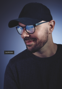
Luca Nichetto
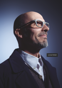
This eyewear was designed like a custom-tailored suit, to perfectly fit the size and shape of my face. There are two versions: one of them showcases neutral and dark tones (an accessory to be worn every day); the other features a red accent that colors the internal part of the frame and the temples (giving these glasses a stronger character). The juxtaposition and combination of wood and aluminum plays an important role not only in the stability of the glasses but also visually in terms of the level of detail. The result, beyond – of course – reflecting my personal taste, fits impeccably and is surprisingly comfortable and light, thanks to the materials and quality of the manufacturing process.
.
Lorenzo Palmeri
Glasses change people. As someone who wears glasses, I know it well. In fact, I consider them like a mask, so much so that I think the ideal situation would be to have a pair for every occasion, if not for every day of the week.
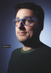
You don’t want the design to diverge much from the modern archetypes of glasses/sunglasses, but you want to accentuate it, emphasize the dynamics of expression.
.
Matteo Ragni
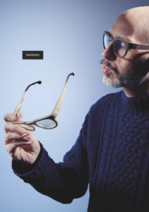
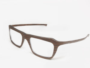
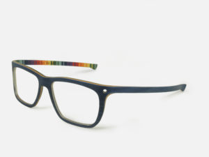
“viewfinder” is a frame with calibrated proportions and some surprising details. The small holes at the joint between the temples and the lenses create a new perspective, an unexpected point of view, a little peephole through which to spy the idea that you were looking for: to frame inspiration and glimpse that bit of the sky you might otherwise miss.4 other small objects are also cut out of the curved blank from which the frames are made: two medallions/key fobs from the lens holes and two money clips from below the temples on the sides. The scrap turns into new, functional objects, to use or to give away. A small gesture to reduce waste and give new meaning and value to a material that would otherwise be discarded.The internal structure of the plywood is composed of multicolored slices to recreate the colors of the rainbow, symbol of peace and freedom.The 45-degree bevel of the lens/temple junction emphasizes this color play, increasing the visible surface of the thickness.
.
Elena Salmistraro
To design these glasses, I followed a primitive but very intimate design methodology: I started directly from a photo of myself, using my face as the basic measure.
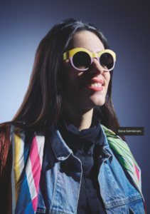
While playing around with the drawings, I began to isolate shapes and movements that I thought were interesting and the latter became the central focus of my design. The observation of this almost circular movement – that has a starting point, thicker and more energetic, and an ending point, lighter and more delicate; which rarely concludes with an exact meeting of these two points to close the figure – was the beginning, the driving concept. In order not to distort the concept of W-eye glasses, I focused on natural, bright woods and colors, which enhance wearability and keep them from becoming excessive or over the top. These tones are clearly separated, creating an above and a below. A true reflection of the initial idea of a brushstroke, with a beginning and an end which, at the same time, generates an evident contrast with the declared fluidity of the structure. A kind of intentional distortion, meant to surprise and attract.


